PDC
Professional Development Club for graduate students at University of Ottawa
SITE DESIGN
WEBSITE REDESIGN | JAN - MAR 2023
PROBLEM
The PDC at the University of Ottawa relies on its website to recruit members, advertise project opportunities, and offer career development resources. The current site has a severely outdated and incohesive visual design, as well as accessibility issues, which deters its target users – graduate students.
SOLUTION
Our team redesigned the website through a complete overhaul of the information architecture, content layout, and UI design elements to deliver a far more delightful experience.
SCOPE
11 weeks
TEAM
Alice Bae (UX Designer)
Roshita Jaiswal (Web Developer)
Amneet Singh (Back-End Developer)
Ramesh Krishnan (QA Engineer)
TOOLS
Figma
MY ROLE
User Research
Visual Design
Usability Testing

DISCOVER
Heuristic Analysis
To assess areas for improvement in the current website, I conducted a heuristic analysis using the Abby Method. Major issues were identified in three areas: delightfulness, credibility, and accessibility.
Delightful
Significantly lacking visual appeal, feels like an unpolished prototype
Homepage looks plain, not engaging/interactive
Credible
Outdated visuals (font, color) lowers credibility and perceived quality of PDC
Accessible
Buttons and links have low color contrast with background (problematic for color blind people)
Excessive italics (problematic for dyslexic people)
CURRENT SITE

User Interviews
PDC offers career and academic resources to graduate students at uOttawa. I interviewed 2 international and 2 Canadian graduate students to understand their behaviors and needs in professional development.

I’m not sure my resume is well-written

I only take career advice from reliable and experienced sources

I’m very nervous and unconfident about job interviews

As an international student, I struggle to network

I mostly use career websites
(The Muse, Monster, etc.) for information
DEFINE
The Problem
How can we redesign the PDC website so that students perceive the resources offered as valuable and credible?
DEVELOP
Design Goals

Boost visibility of core features: Projects, Events, Mock Interview Booking, Resume Review Request

Overhaul UI design for greater visual appeal and consistency

Ensure compliance with accessibility guidelines
Wireframes
I started with low-fidelity wireframes with pen and paper to map out the high-level layout of content. These were developed into mid-fidelity wireframes with greater level of detail on each page.
HOME

PROJECTS

CAREER & ACADEMIC RESOURCES


DELIVER
Usability Tests
VOLUNTEER/JOIN THE TEAM BUTTONS
Problem: Users were unsure which to click to become a PDC member due to confusing nomenclature
Solution: Established one consistent phrase "Join the Team" ("Volunteer" seems like just a one-time job)
HOMEPAGE
Observation: First thing users did was scroll down for a quick scan of page content
Design Decision: Added a section for Career Resource links
Reason: Homepage is valuable real estate to showcase core features (Projects, Events, Mock Interview Booking, Resume Review Request)

SKILL FILTER
Problem: Users were frustrated when having to click the drop-down menu every time to apply an additional skill filter
Solution: Openly displayed all skills with checkboxes to allow rapid multiple selection
Final Design
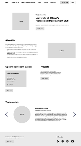
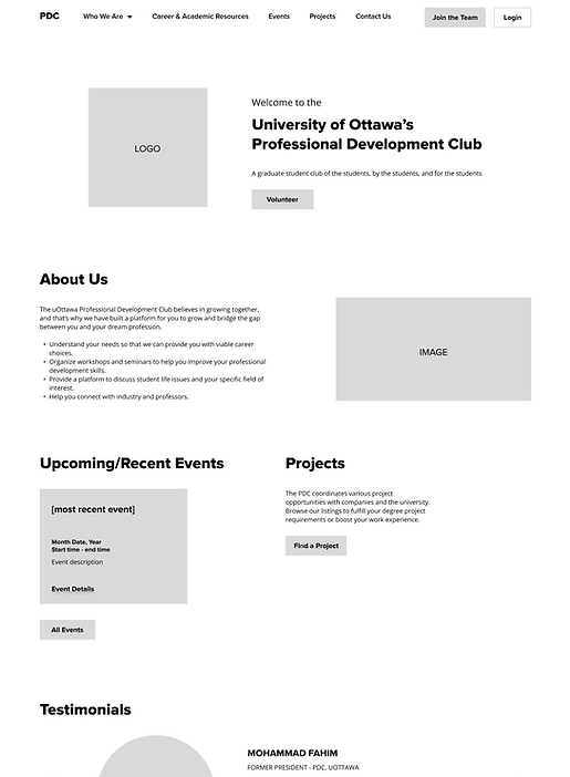
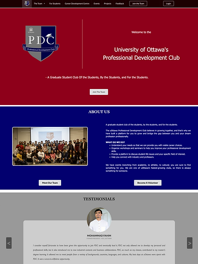
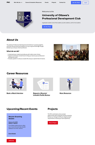
CURRENT HOMEPAGE
REDESIGNED HOMEPAGE
CORE FEATURE VISIBILITY
Core features (buttons under Career Resources) are highly visible and easily located on the homepage. Now, users have additional ways to access PDC’s most valuable offerings other than the main navigation.
ENHANCED VISUAL DESIGN
A vibrant color palette (indigo, grey, white and red) and modern fonts (Proxima Nova and Open Sans) are kept consistent throughout all pages. Increased white space makes content appear more aesthetically pleasing and easy to scan.
CURRENT PROJECTS PAGE

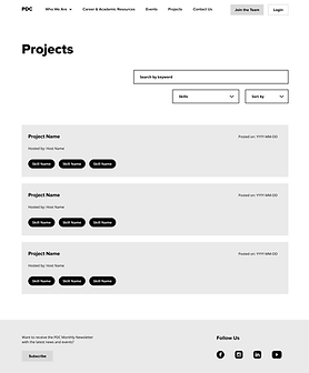
REDESIGNED PROJECTS PAGE

POWERFUL SEARCH FUNCTION
The redesigned “Skills” filter allows rapid multiple selection with checkboxes and results don't update until the user clicks “Apply”. Logical hierarchy and naming of skills tags simplifies the process of applying filters. The new filter and sort functions give users a greater degree of control in interacting with the system, eliminating frustration.
PROJECT CARDS
Only key high-level metadata is presented in each project card to remove unnecessary distractions. Indigo skills tags are easily distinguishable, allowing quick scans of projects. The enhanced design of cards overall makes projects seem more visually appealing to users.