Taliesin
The School of Architecture at Taliesin's academic website
WEBSITE REDESIGN | OCT 2018
PROBLEM
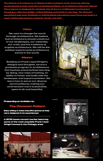
The School of Architecture at Taliesin (SOAT) has a poorly designed website. Issues with navigation, typography, and colors makes it difficult to learn about the school and apply to the program.
SOLUTION
I redesigned the information architecture and visual layout to build a more intuitive navigation.
SCOPE
1 week
TOOLS
Sketch
InVision
Optimal Workshop
TEAM
Solo project

DISCOVER
Heuristic Evaluation
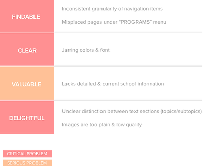
In order to pinpoint key areas for improvement, I evaluated Taliesin's compliance with standardized usability principles.
Findability, clarity, value and delightfulness were identified as main problems, indicating the need to redesign the information architecture, enhance visual elements, and add content.
Competitive Analysis
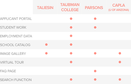
School websites generally offer similar content in a conventional hierarchy so prospective students can compare different programs. A feature analysis helped identify functions and content required to be on par with other schools. Taliesin was missing several crucial features:
Student Work & Graduate Employment Data
Indicators of program outcomes that attract students
Applicant Portal
Keeps candidates informed and engaged throughout the admissions process
The Problem
How might we redesign the site so that students can easily learn about the program and apply online?
DEFINE
Building the New Site Structure
CARD SORT & TREE TEST
Understanding the audience’s mental models and expectations in navigating academic websites would be crucial for creating an effective information architecture. I conducted closed card sorting and tree testing with categories commonly used by schools, evaluating existing grouping and labeling conventions. Clusters quickly emerged as participants sorted items similarly - except “Tuition & Aid” and “Academic Calendar”, which were associated with various categories.
SITEMAP
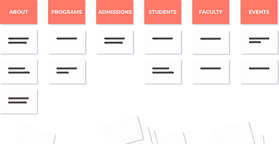
Navigation was continuously refined through card sorts and tree tests to build a new sitemap. The redesigned architecture features global elements in the header and footer that provide quick access for main tasks. I also added a “Registrar” category to properly accommodate “Tuition & Aid” and “Academic Calendar”.

DEVELOP
Low-Fidelity Wireframes
During initial wireframing, I developed a variety of text & image layouts to make content more digestible and enjoyable. The new visual structure would clearly separate information on the two programs (Master of Architecture and Immersion Experience) - which aren't fully distinguishable on the current site. Low-fidelity designs were then developed into a mid-fidelity prototype for testing.

DELIVER
Usability Testing

Problematic Nomenclature
Participants weren't sure if “Immersion Experience” was a separate program, and saw it as a component of the M.Arch degree due to the word "experience". It was renamed "Immersion Program" to match the granularity of the M.Arch label, eliminating the confusion that emerged during usability testing.
CTA Crowding

Users were also overwhelmed by the consistent visual hierarchy of “Apply”, “See Instructions” and “Applicant Portal” CTAs. The excess of choices makes it confusing to decide where to click. “Instructions” buttons were redesigned to prevent detracting focus from the primary CTA (“Apply”).
Mid-Fidelity Wireframes

VARIOUS USER TYPES
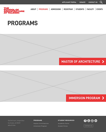
"Apply" and "Applicant Portal" buttons meet the needs of both new candidates and those who've already started/submitted their applications. The separate sections for M.Arch and Immersion satisfies the different program interests within prospective students.
NAVIGATION OVERVIEW
Each main navigation item has a page outlining all the subpages it houses, providing users with more control and awareness of their location.
CURRENT DESIGN
.png)
REDESIGN
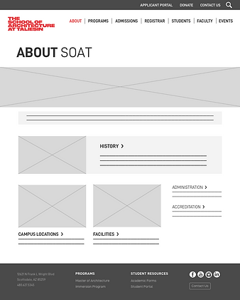
CLEAN LAYOUT
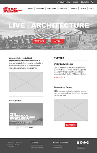
Text and image are organized into clearly marked sections.
Font choice and proper alignment enhance the visual arrangement and readability of content.